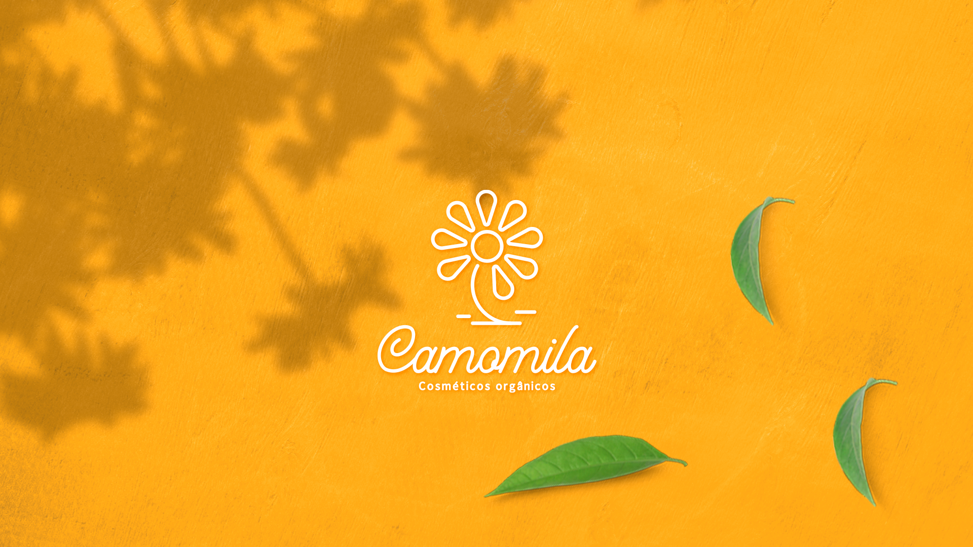
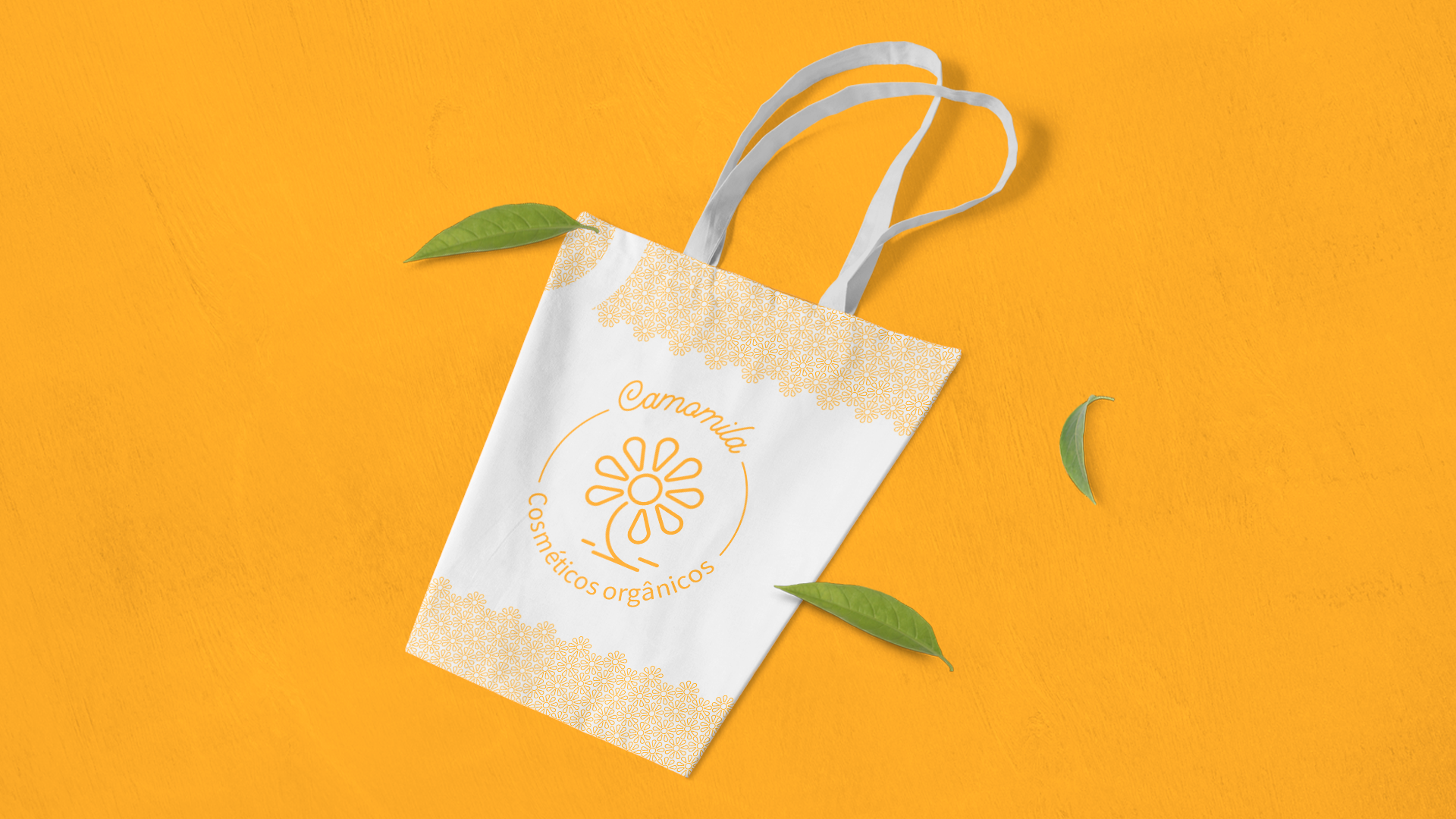
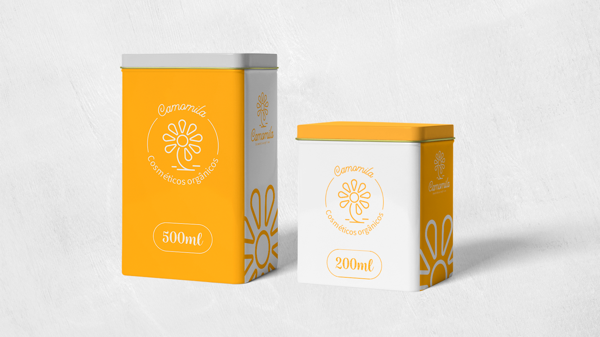
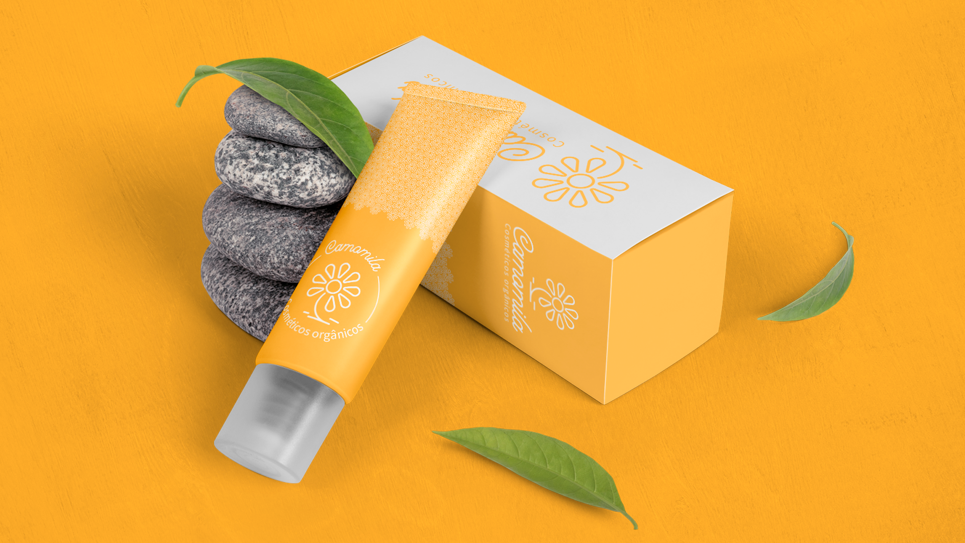
Camomila
Esse projeto foi desenvolvido com muito amor para uma marcar de cosméticos orgânicos que está iniciando seus trabalhos.
O nome foi escolhido pela cliente, como algo que a remete paz e calma.
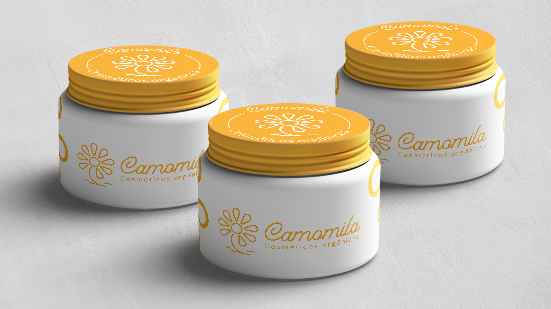
As cores amarelo e branco representam a flor de camomila, sua suavidade e singularidade!
A marca nasceu da ideia de trazer mais simplicidade para o cotidiano das pessoas, pensando na saúde e bem estar de quem irá fazer o uso de seus produtos, mostrando que não precisa de muito para cuidar de nós mesmos e do meio ambiente!
O nome foi escolhido pela cliente, como algo que a remete paz e calma.
As cores amarelo e branco representam a flor de camomila, sua suavidade e singularidade!
A marca nasceu da ideia de trazer mais simplicidade para o cotidiano das pessoas, pensando na saúde e bem estar de quem irá fazer o uso de seus produtos, mostrando que não precisa de muito para cuidar de nós mesmos e do meio ambiente!
This project was developed with great love for an organic cosmetics brand that is starting its work.
The name was chosen by the client, as something that reminds her of peace and calm.
The yellow and white colors represent the chamomile flower, its softness and uniqueness!
The brand was born from the idea of bringing more simplicity to people's daily lives, thinking about the health and well-being of those who will use their products, showing that they don't need much to take care of ourselves and the environment!


Art direction: Pedro Henrique
Company: Camomila Cosméticos orgânicos
Obrigado pela visita!